The 10 best British political posters
SAM DELANEY
We celebrate the finest election propaganda
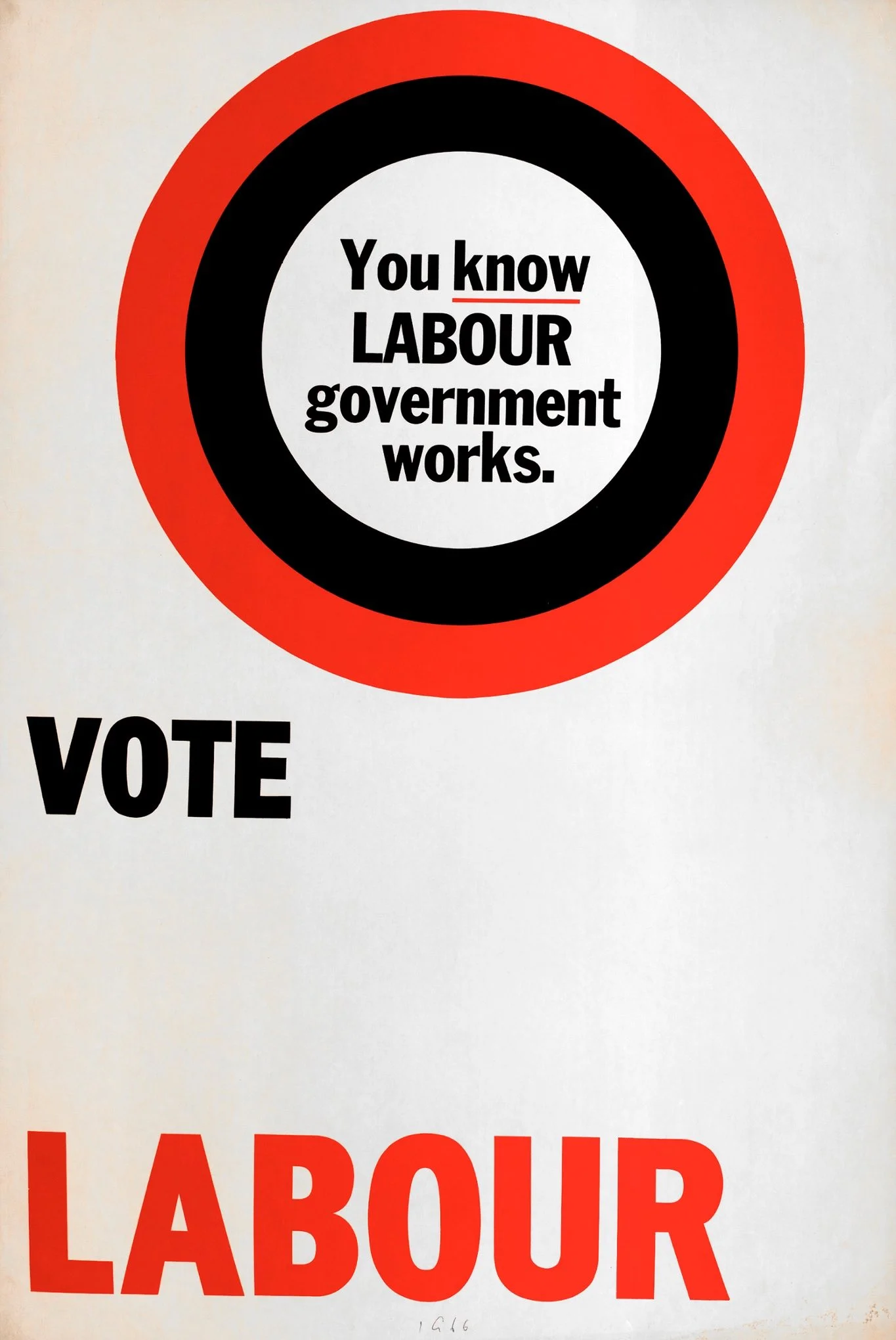
You Know Labour Government Works
1966
Strategically, this is an absolute car crash of a poster. It neither makes any promises nor stirs up any fear of the opponents. But the bold, quirky design was something else. Labour leader Harold Wilson had set about revolutionising the party’s communications with the appointment of his “Three Wise Men” – Denis Lyons, Peter Lovell-Davis and ad man David Kingsley. They brought a bit of panache to the tatty, flat-cap image. Two decades later, when Peter Mandelson was appointed the party’s communications chief, he plundered the Three Wise Men archive for inspiration: “I loved it,” he said. “It became the basis of the changes I eventually made to the party image.”
Labour Isn’t Working
1978
Margaret Thatcher initially rejected this famous poster, telling Saatchi & Saatchi chairman Tim Bell: “You know perfectly well that you should never have the other side’s name in your own poster!” Bell politely explained that it was a double entendre. “Well, it can’t be very good because I don’t get it!” snorted Thatcher. Labour’s Denis Healey called it a “fraud” when he learned that the people in the dole queue were in fact members of Hendon Young Conservatives. The controversy ran for weeks – Bell estimated that the furore earned the equivalent of £5m in free publicity. It was the start of a long and largely fruitful marriage between the Tories and the Saatchis, helping the party win the next four elections and the agency grow into a global behemoth.

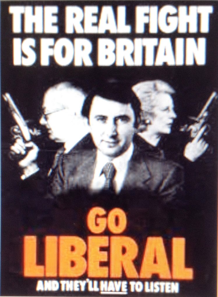
The Real Fight Is for Britain
1979
Political advertising, much like political cartoons, has a tendency to veer off into incomprehensible visual analogies. Complex issues are shoehorned into posters, leaving voters neither convinced nor repelled, just a bit confused. The Lib Dems have always struggled to produce great ads, due largely to budget limitations. I stumbled across this effort while researching my recent book about British politics and advertising and I was utterly fascinated. What is it trying to say? And why is David Steel looking so scarily enigmatic? It’s impossible to tell. But there is something so brilliantly strange about this poster that I think it warrants a place in the hall of fame.
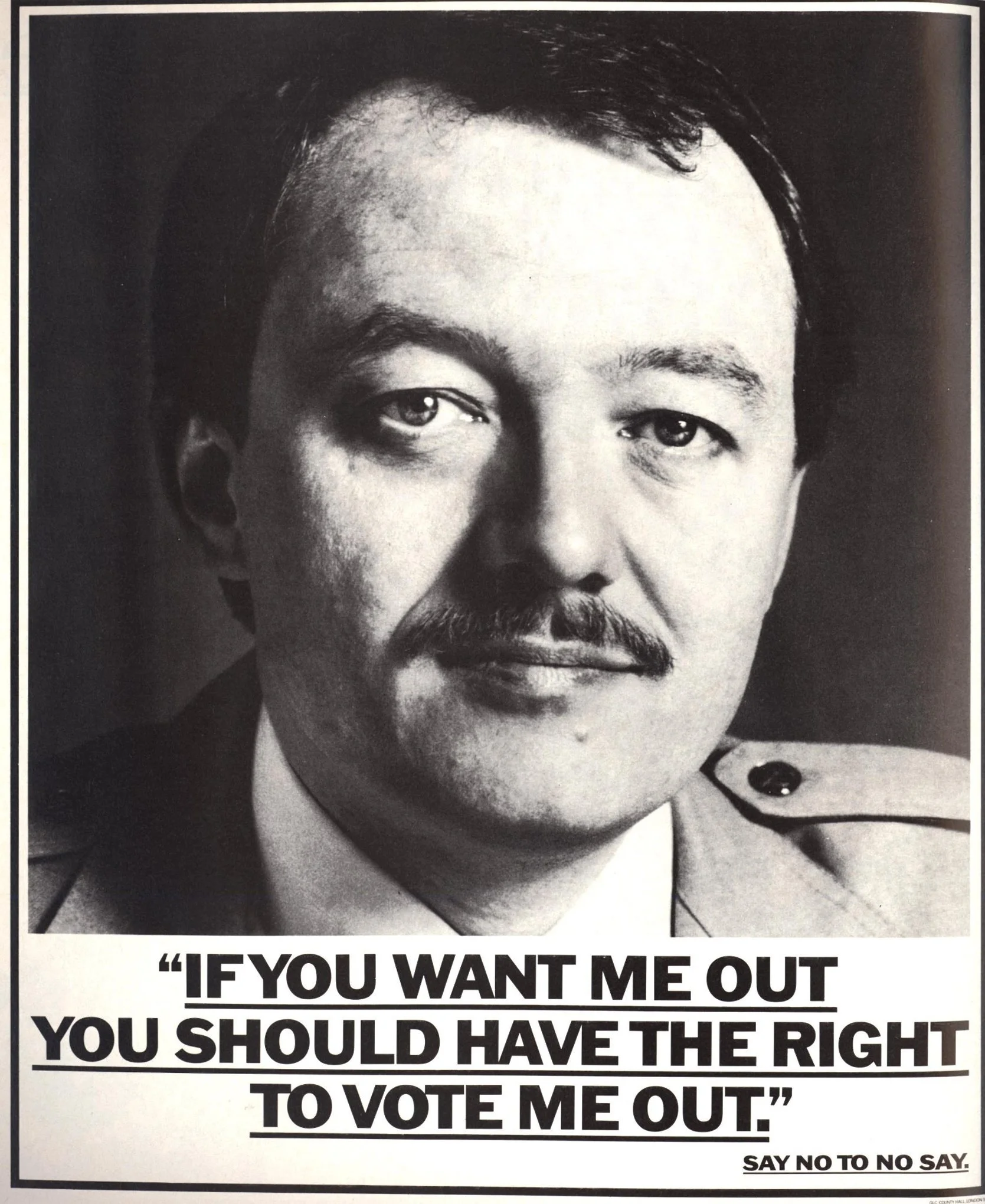
If You Want Me Out, You Should Have the Right to Vote Me Out
1984
John Webster was the ad man who, among other things, invented the Smash Martians, the Sugar Puffs Honey Monster and George the Hofmeister Bear. Ken Livingstone hired him and his agency BMP to create a campaign to fight the abolition of the Greater London Council in 1984. It didn’t save Livingstone but it did turn a local issue into a national talking point. It also shifted perceptions of advertising, showing that it could be a force for social change. BMP went on to become the Labour party’s main agency for over a decade.
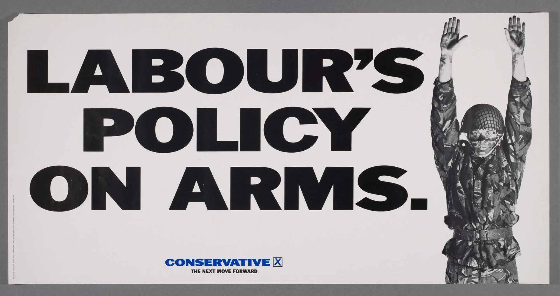
Labour’s Policy On Arms
1987
By 1987, Tim Bell had left Saatchi & Saatchi but still had the prime minister’s ear. The Tory campaign machine spiralled into chaos as chairman Norman Tebbit worked with Saatchi & Saatchi at Central Office while Thatcher and her consigliere David Young consulted with Bell (now with new agency Lowe Howard-Spink & Bell) at Number 10.
Tebbit and Young would eventually engage in a shoving match in Downing Street over whose posters should run. The best of the lot was this Saatchi effort. Neil Kinnock had slipped up in a television interview by suggesting that, in the event of a Soviet invasion, he would encourage Brits to wage resistance through guerrilla warfare. It was an open goal for the agency creatives.
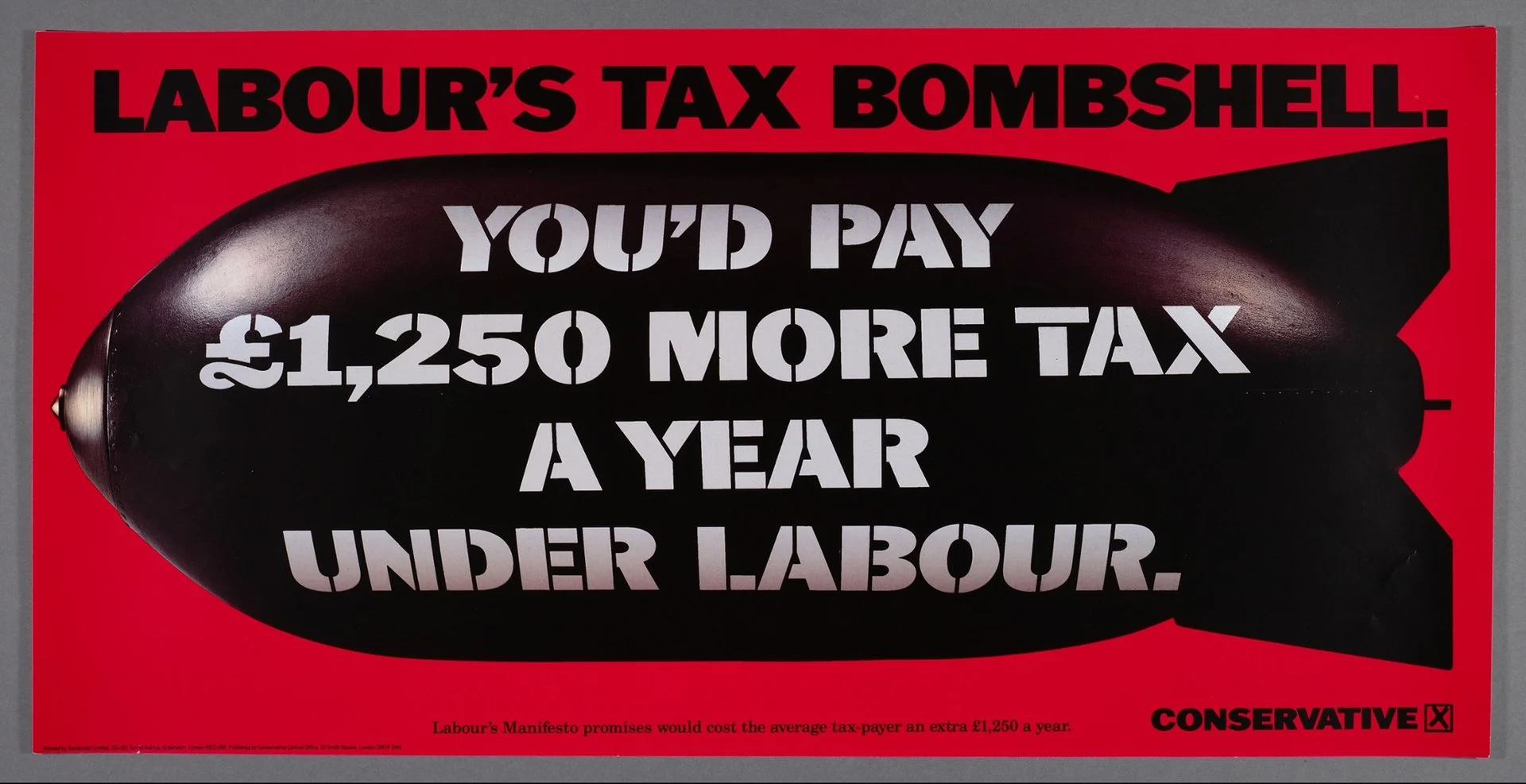
Labour’s Tax Bombshell
1992
“It’s kill or get killed in this game,” Jeremy Sinclair, the Saatchi & Saatchi creative director, told Tory campaign chief Shaun Woodward in 1992. Woodward explained that new PM John Major didn’t want to run a negative campaign. “That’s fine, if you don’t mind losing,” Sinclair retorted. Tory wonks calculated the spending pledges in Labour’s manifesto as costing £35bn. Sinclair “basically divided it by the number of taxpayers in Britain”. The mathematics might not have been the most rigorous but it allowed the Saatchi team to produce the most notable poster of the campaign, which would define the entire agenda leading up to polling day.
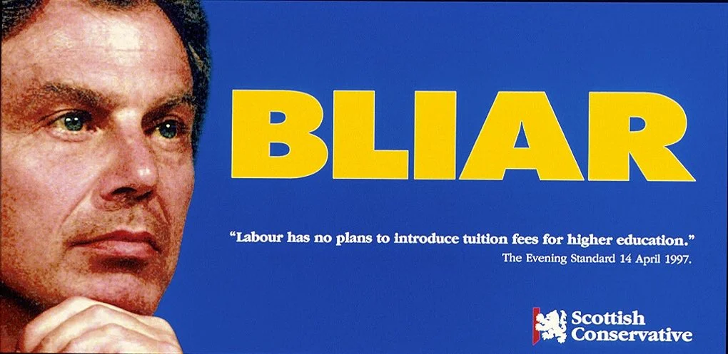
Bliar
1999
In the Scottish parliamentary elections of 1999, the Scottish Conservatives hired little-known ad agency Yellow M, which produced a series of memorable posters including the celebrated “Bliar”, protesting against increased tuition fees. They also printed the ad on stickers and badges for angry students.
The term would eventually pass into the popular lexicon for very different reasons. The Tories wound up winning an improbable 18 seats in a country where they had previously been anonymous. William Hague was so impressed he hired Yellow M for the 2001 general election campaign.
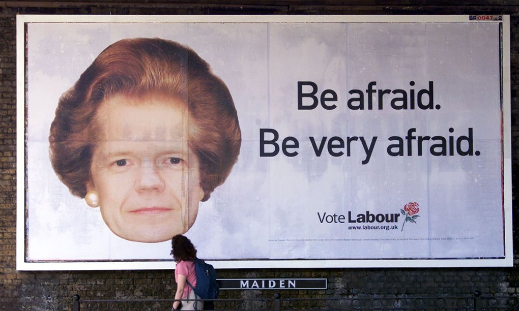
Be Afraid. Be Very Afraid
2001
Labour’s ad men had always felt one step behind their brutal and relentless counterparts at Saatchis. But Blair recruited Trevor Beattie, the creative master behind the Wonderbra “Hello Boys” poster and French Connection’s FCUK campaign, and soon Labour were beating the Tories at their own game. “This will be the most iconic image of this election,” Beattie told Tony Blair as he unveiled the poster depicting Tory leader William Hague with Thatcher’s hair at No 10. Blair was concerned that it was too flippant. But then he started to laugh. “You’ve just shown why it works,” Labour’s communications chief Alastair Campbell told him. “Because if it’s funny, it’s fine. People look at it and smile but it makes a really powerful negative point.”
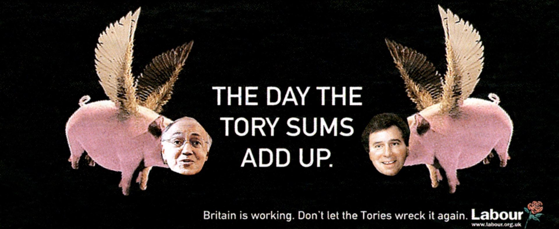
The Day Tory Sums Add Up
2005
“We were skint and so we decided to announce a stunt where we got members to come up with poster ideas,” says Alastair Campbell. “This was the winner so we just stuck it on the side of a truck and called a press conference.” But the stunt backfired. A Conservative blogger suggested that the poster was antisemitic (both Michael Howard and Oliver Letwin, featured on the poster, are Jews). The press assumed that Beattie had created the poster and camped out on his doorstep. Worried, he emailed Campbell for advice. “Tell them to fuck off and cover something important,” replied Campbell.

Vote Conservative
2015
“Posters will always be important because if you can’t get your message across in five or six words then, chances are, your message isn’t right in the first place,” says Jeremy Sinclair. This time around, the Saatchi team managed to do it in no words at all. This is the best poster of the campaign so far – expressing a clear and powerful message in a single, compelling image. Whether the fear of an SNP/Labour coalition is really the high-salience issue that the best ads usually focus on is questionable. But we’ve got to assume that the Saatchis have done their research.
You may also like...
© Guardian News & Media Ltd 2017